


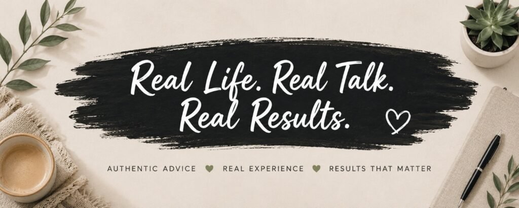
I have a confession.
Whenever I start a new YouTube channel, I spend about 14 seconds thinking about the content and three hours obsessing over the banner.
Because apparently, my brain believes viewers will forgive bad videos, but not ugly graphics. Lol.
The problem is that most beginner YouTube banners either look completely empty or like somebody spilled every font, emoji, and Canva element onto the same canvas and called it “branding”.
Somewhere between “boring corporate PowerPoint” and “Vegas casino billboard” is the sweet spot.
The good news? You don’t need to hire a designer, buy any expensive software, or spend an entire week learning Photoshop.
In fact, some of my absolute favorite YouTube banners are what you would call ridiculously simple. We cheer!!
If you’re still deciding whether to start a YouTube channel, a blog, or both, check out my guide on how to start a blog. I personally love building both because they can work together to grow your audience and income over time.
What Size Should a YouTube Banner Be?
Before you spend hours designing the perfect banner, it’s important to make sure you’re using the right dimensions.
The recommended YouTube banner size is 2560 x 1440 pixels. This gives your banner enough space to display properly across desktop computers, mobile devices, tablets, and TVs.
The tricky part is that not all of that space will be visible on every device.
That’s why YouTube has what’s called a safe area. This is the section in the center of your banner where your text, logo, and important information should be placed. If you put important elements too close to the edges, they may get cut off on smaller screens.
Here are the recommended YouTube banner specifications:
- Recommended size: 2560 x 1440 pixels
- Minimum size: 2048 x 1152 pixels
- Maximum file size: 6 MB
- Safe area: 1546 x 423 pixels
If you’re creating your banner in Canva, most YouTube banner templates already account for these dimensions. Just make sure you preview your design on both desktop and mobile before publishing.
Trust me on this one. Nothing is more frustrating than creating a beautiful banner only to discover your channel name got chopped in half on mobile.
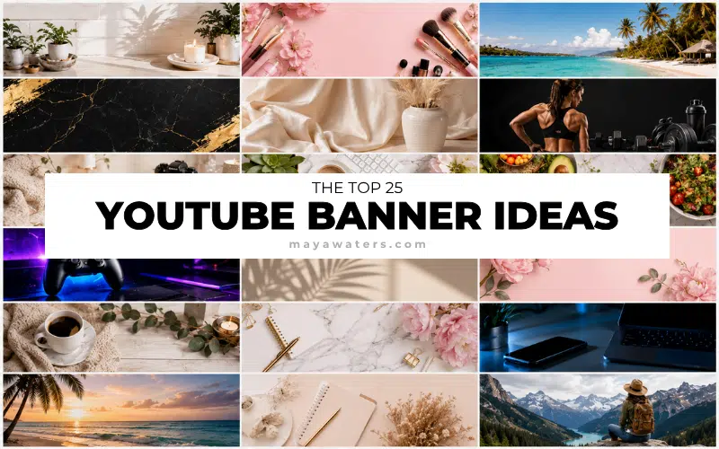
Anyways, let’s look at 25 YouTube banner ideas that actually look good – no, AMAZING – as well as a few mistakes I wish creators would stop making. 😉
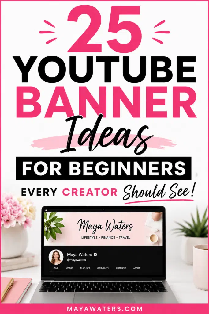
☝️ Save this Pin to your favorite board.
I would love it if you followed me on Pinterest too!
Don’t Create Your Banner Until You Read This
Before we get to these YouTube banner ideas for beginners, let’s talk about what not to do!
Bear with me for a minute while I go on a tiny YouTube rant.
One thing I’ve noticed is that a lot of beginners treat their YouTube banner like a garage sale flyer. They try to squeeze everything onto it. Suddenly there are 5 fonts, six colors, 3 social media handles, and one motivational quote with a photo that looks like it was taken on a flip phone sometime around 2007.
Funny enough, this is almost identical to one of the biggest blogging mistakes I see. New creators often think more graphics, more widgets, and more design automatically means better. Most of the time, simpler wins.
Your banner really only has one job: tell people who you are and what your channel is about. That’s it. If someone lands on your channel and needs a detective kit to figure out what kind of videos you make, the banner isn’t doing its job.
Personally, I think most beginner YouTube banners are trying way too hard. Everyone wants their channel to look like 1,000,000 subscribers who showed up overnight.
Meanwhile, some of the absolute best banners on YouTube are surprisingly simple. A clean photo, a clear channel name, and a short description are often more effective than a design that looks like it was assembled during a caffeine-fueled Canva emergency.
Maybe it’s just me, but I’d rather visit a channel that looks clean and professional than one that looks like Times Square had a baby with a scrapbook store.
Before we get into the banner ideas, let’s quickly look at a few common mistakes that make perfectly good channels look messy.
1. The Clean Name Banner
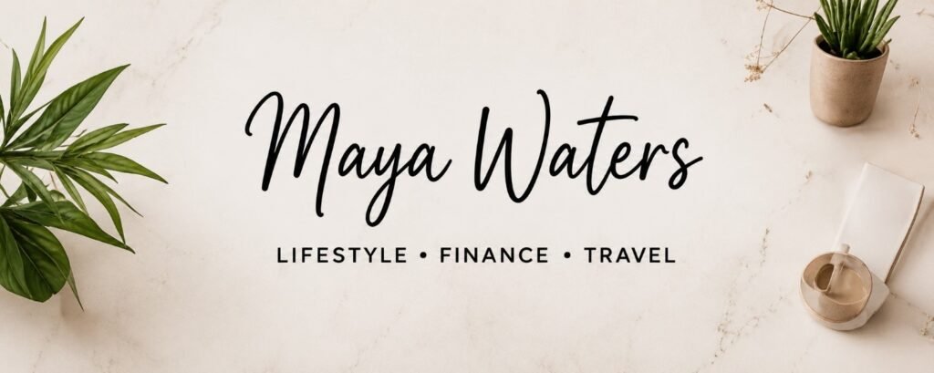
This is one of my favorite YouTube banner ideas for beginners because it’s almost impossible to mess up.
Simply use:
- Your channel name
- A clean background
- One or two brand colors
That’s it.
No clutter. No chaos. No visual gymnastics.
I actually think most new creators would be better off starting with a simple banner like this and upgrading later rather than trying to build the next Netflix homepage on day one.
Best for:
- Personal brands
- Lifestyle channels
- Vlogs
- Beginner creators
2. The “What You’ll Learn” Banner
This banner clearly tells viewers what they can expect from your channel.
Examples:
- Budgeting Tips & Side Hustles
- Easy DIY Projects
- YouTube Growth Strategies
- Family Travel Adventures
I love this style because it removes all guessing.
If someone finds your channel through search, they immediately know they’re in the right place. And honestly, that’s more important than having the prettiest banner on YouTube.
The same thing applies to blogs. One of the biggest lessons I learned about SEO for bloggers is that both readers and search engines prefer content that clearly communicates what it’s about right away.
3. The Large Photo Banner
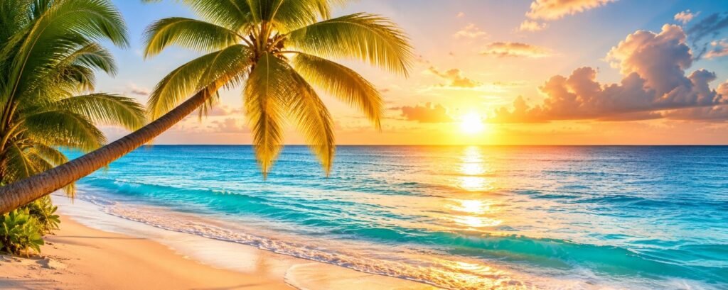
This style uses a high-quality photo as the main focus.
Think of it as your digital first impression.
A smiling photo of yourself can work incredibly well for:
• Coaches
• Bloggers
• Business owners
• Content creators
But don’t feel like you have to use your own face. A beautiful travel photo, your workspace, your products, your pet, or even a favorite landscape can work just as well if it reflects your channel and personality.
That said, if you do use a photo of yourself, please use a current one.
I can’t be the only person who clicks on a channel and discovers the profile picture looks like it was taken during the Bush administration.
4. The Before-and-After Banner
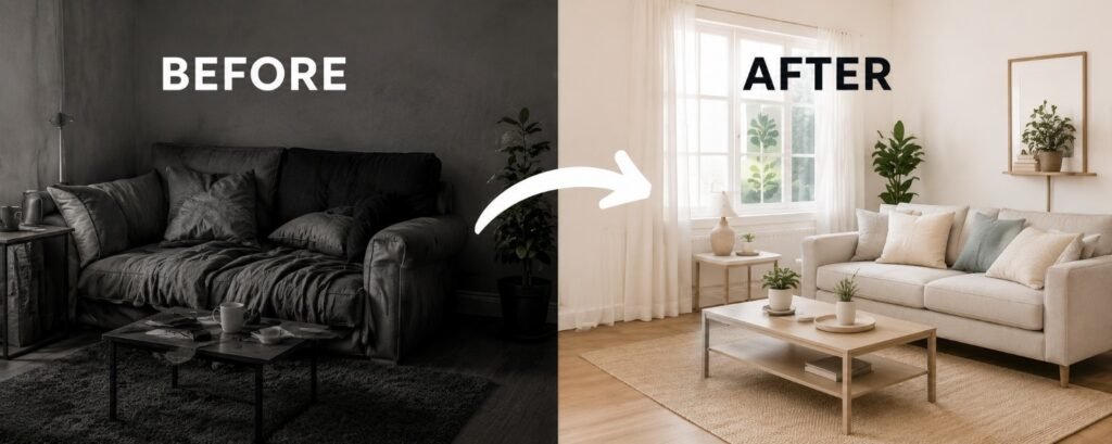
If your channel helps people achieve a transformation, this banner idea can be incredibly effective.
People love seeing results. It’s one of the reasons makeover shows, renovation shows, and weight loss shows have been popular for decades. We like seeing where someone started and where they ended up.
A before-and-after banner works well because it immediately shows viewers what kind of transformation your content can help them achieve.
Examples:
- Fitness channels
- Home renovation channels
- Decluttering channels
- Personal finance channels
- Beauty channels
For example, if your channel is about paying off debt, you could visually represent the journey from financial stress to financial freedom.
Just don’t make it look like one of those late-night infomercials where someone supposedly lost 400 pounds, retired at 27, and bought a private island after watching three YouTube videos.
A little realism goes a long way.
Best for:
- Finance creators
- Fitness channels
- Home improvement channels
- Transformation-focused content
5. The Minimalist Banner
If I were starting a YouTube channel today, this is probably the style I’d choose.
A minimalist banner focuses on the essentials and leaves plenty of empty space. Instead of trying to fill every corner, it lets the important elements stand out.
Typically, you’ll see:
- Clean fonts
- Lots of white space
- Limited colors
- Very little text
The funny thing about minimalist design is that it’s harder than it looks. Most people keep adding things because they’re worried the banner looks too empty.
- Then they add another icon.
- Then another phrase.
- Then another color.
- Then another graphic.
And before you know it, the minimalist banner is gone, and you’ve accidentally created a visual buffet.
Personally, I think most YouTube banners would improve if creators removed 25% of what’s currently on them.
Maybe even 50%.
Best for:
- Personal brands
- Lifestyle creators
- Business channels
- Educational content
6. The Brand Color Banner
One of the easiest ways to make your channel look more professional is to consistently use the same colors throughout your branding.
Think about Starbucks. Think about McDonald’s. Think about Target. You can recognize them from their colors before you even see the logo.
Your YouTube channel doesn’t need to become the next billion-dollar brand, but using the same colors on your banner, thumbnails, and profile picture can make your channel feel much more polished. It’s also how you build a solid brand!
I think a lot of beginner creators accidentally make their channels look chaotic because every graphic uses a completely different color palette. One thumbnail is bright pink, the next is dark blue, and the banner looks like it belongs to somebody else entirely.
Best for:
- Personal brands
- Business channels
- Educational channels
- Lifestyle creators
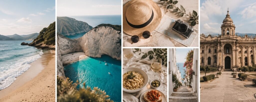
7. The Niche Showcase Banner
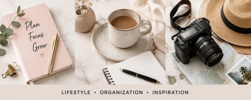
This banner style uses a few carefully selected images to instantly show viewers what your channel is about.
For example, a baking channel might feature cakes, cookies, and cupcakes. A travel creator might show a few destinations. A gardening channel could include flowers, vegetables, and outdoor spaces.
The trick is not getting carried away.
I’ve seen creators try to showcase every possible topic they’ve ever talked about. The result usually looks like someone emptied an entire scrapbook onto their banner and hoped for the best.
Choose a few visuals that represent your niche and keep it simple.
Best for:
- Travel channels
- Recipe channels
- DIY creators
- Hobby channels
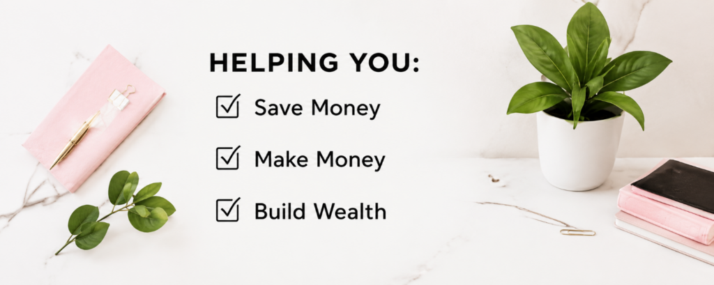
8. The Simple Quote Banner
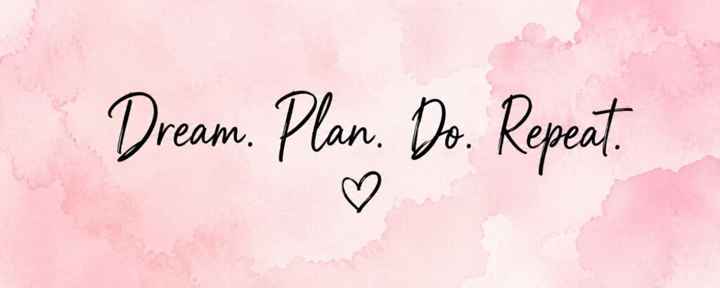
Sometimes a short phrase can say more than a complicated design.
A simple quote banner uses a short message that captures the purpose of your channel.
Examples:
- Helping Women Build Wealth
- Travel More, Spend Less
- Simple DIY Projects Anyone Can Do
- Building a Better Life One Day at a Time
Personally, I’d avoid anything that sounds like it was generated by a corporate motivational poster.
If your quote sounds like something you’d actually say out loud, you’re probably on the right track.
Best for:
- Personal brands
- Coaches
- Bloggers
- Motivational channels
9. The Content Schedule Banner
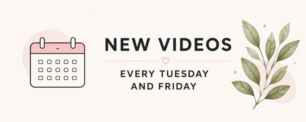
This banner tells viewers exactly when they can expect new content.
Examples:
- New Videos Every Tuesday
- New Videos Every Monday and Thursday
- Weekly Uploads
I know this style isn’t quite as popular as it used to be, but I still think it works if you’re actually consistent.
That’s the important part.
If your banner says, “New Videos Every Tuesday” and your last upload was 8 months ago, that’s not a content schedule. That’s evidence!
Best for:
- Educational channels
- Podcast channels
- Consistent creators
10. The Faceless Creator Banner
Not everyone wants their face all over the internet.
Honestly, I completely understand that.
Some people value their privacy. Some don’t want coworkers discovering their side hustle. Others simply aren’t comfortable being on camera.
The good news is that a faceless channel can still have amazing branding.
Instead of using your photo, you can use:
- Illustrations
- Logos
- Icons
- Screenshots
- Custom graphics
I’ve seen faceless channels with better branding than channels run by full-time influencers.
Best for:
- Faceless YouTube channels
- AI channels
- Side hustle channels
- Educational creators
11. The Collage Banner
A collage banner combines several photos into one design.
This style works particularly well when your channel covers multiple aspects of a lifestyle or hobby.
For example, a family creator might show travel, pets, home life, and special moments. A lifestyle creator could showcase fashion, food, fitness, and daily routines.
The challenge is knowing when to stop adding photos.
The best collage banners feel intentional. The worst ones feel like someone uploaded their entire camera roll after two glasses of wine.
Less is usually more.
Best for:
- Family channels
- Lifestyle creators
- Travel creators
- Food channels
12. The Logo-Focused Banner
If your YouTube channel is connected to a business, a logo-focused banner can work really well.
The logo becomes the centerpiece while everything else stays clean and simple.
That said, I think a lot of new creators spend way too much time worrying about logos before they’ve even made ten videos.
I’ve seen people spend weeks choosing fonts and colors for a logo while completely avoiding the part where they actually create content.
If that’s you, I say publish the videos first and perfect the logo later.
Content pays the bills.
Perfect logos don’t.
Best for:
- Business channels
- Brand channels
- Product-based businesses
- Service providers
13. The Thumbnail Preview Banner
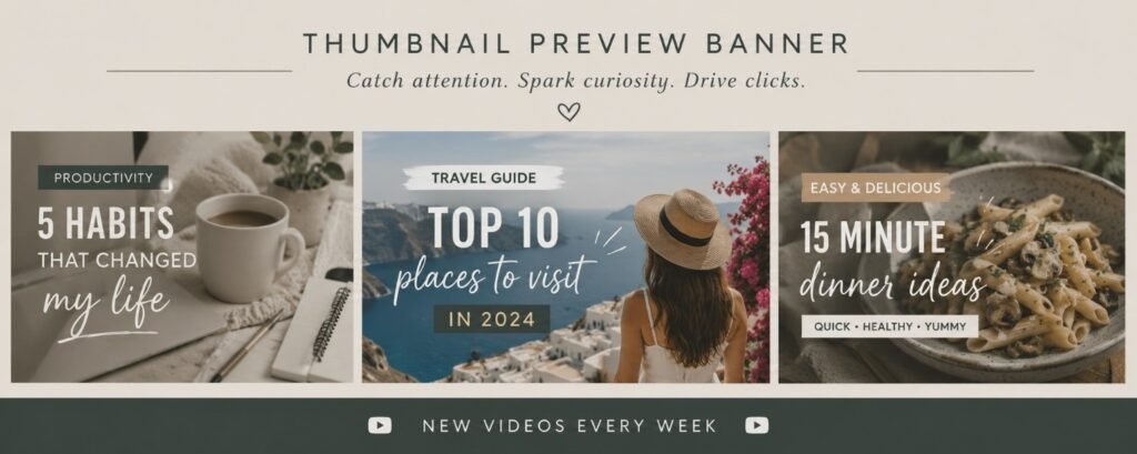
This banner style uses a few of your actual YouTube thumbnails to give visitors a sneak peek at your content.
I really like this idea once a channel has a decent library of videos because it instantly shows people what your content looks like. If someone loves your thumbnail style, there’s a good chance they’ll enjoy your videos too.
The only catch is that your thumbnails need to look reasonably good. If your thumbnails are still in their awkward teenage years, you might want to wait a little before putting them on your channel banner for the whole internet to inspect.
Best for:
- Established channels
- Educational creators
- Tutorial channels
- Review channels
14. The Three-Topic Banner
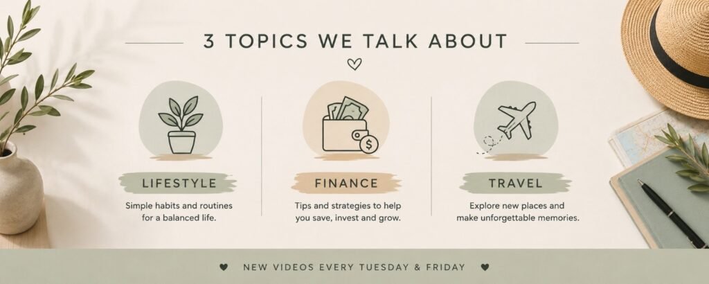
One of the biggest mistakes new creators make is trying to be everything to everyone.
A three-topic banner solves that problem by clearly telling viewers exactly what your channel covers.
For example:
- Blogging
- Affiliate Marketing
Or:
- Budgeting
- Saving Money
- Investing
Or:
- Travel
- Food
- Adventure
I think this is one of the smartest banner styles for beginners because it forces you to get clear about your content. If you can’t summarize your channel in three topics, your audience might struggle to understand it too.
The same idea applies if you’re starting a podcast. Viewers and listeners are much more likely to follow you when they immediately understand what topics you cover.
Best for:
- Educational creators
- Finance channels
- Business channels
- Blogging channels
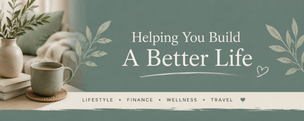
15. The Aesthetic Banner
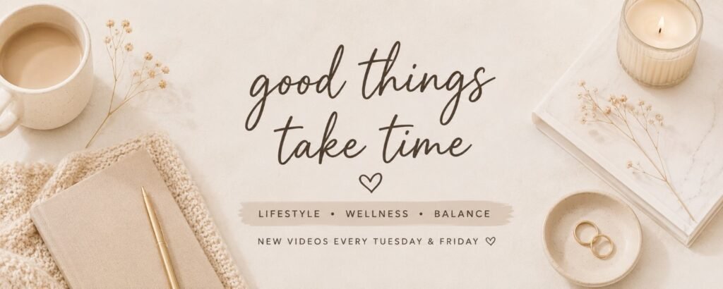
Let’s talk about aesthetics for a minute.
Some YouTube channels are successful because people genuinely enjoy the overall vibe. The colors, fonts, images, and branding all work together to create a certain feeling.
That’s what an aesthetic banner is trying to accomplish.
Think:
- Soft colors
- Clean fonts
- Cohesive branding
- Minimal clutter
The danger is creating something beautiful that tells viewers absolutely nothing about your channel.
I’ve landed on channels that looked stunning but left me wondering if I was about to learn budgeting tips, watch skincare tutorials, or join a cult.
Pretty matters.
Clarity matters more.
Best for:
- Lifestyle creators
- Beauty channels
- Fashion creators
- Vloggers
16. The Tool Showcase Banner
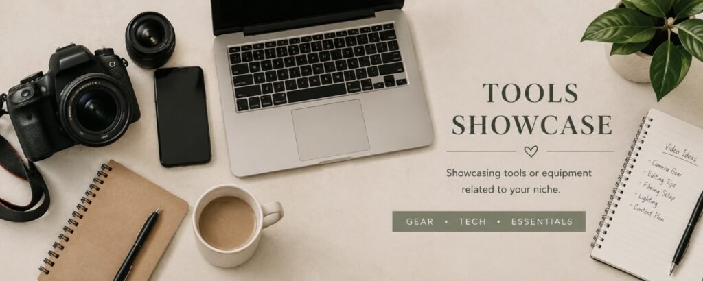
This banner highlights the tools, equipment, software, or products connected to your niche.
For example:
- Cameras for photography channels
- Power tools for woodworking channels
- Microphones for podcast creators
- Canva and blogging tools for content creators
This style works because it immediately signals what kind of content viewers can expect.
Just don’t go overboard.
Nobody needs seventeen logos, twelve software icons, and a giant laptop floating in outer space behind your channel name.
Sometimes one or two well-placed visuals tell the whole story.
Best for:
- Tutorial channels
- Review channels
- Educational creators
- Blogging channels
17. The Handwritten Banner
There’s something about a handwritten-style banner that feels approachable.
It feels personal.
Friendly.
Less “major corporation” and more “hey I’m a real human” vibes.
This style often works well for creators who want their audience to feel like they’re chatting with a friend rather than attending a business seminar.
That said, choose your font carefully.
Some handwritten fonts look elegant and welcoming.
Others look like somebody gave a marker to a golden retriever and hoped for the best.
If people need to decode your channel name like it’s an ancient treasure map, pick a different font.
Best for:
- Lifestyle creators
- Mom bloggers
- Craft channels
- Personal brands
18. The Simple Tagline Banner
Sometimes a short tagline is all you need.
A good tagline quickly tells viewers why they should care about your content.
Examples:
- Helping Women Build Wealth
- Making Money Without Losing Your Mind
- Budget-Friendly Family Adventures
- Simple Living, Better Finances
Personally, I think the best taglines sound like something a real person would actually say.
If your tagline sounds like it came from a three-day corporate retreat where everyone wore matching polo shirts and discussed “synergy,” keep brainstorming.
Your tagline should feel authentic to you and your audience.
Best for:
- Personal brands
- Finance creators
- Business channels
- Bloggers
19. The Results Banner
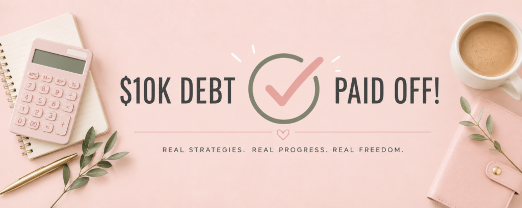
If your channel teaches people how to achieve a specific result, why not show the result?
For example, a finance channel might highlight debt paid off, money saved, or investing milestones. A fitness creator might showcase a transformation. A gardening channel could feature a stunning before-and-after yard makeover.
People are naturally drawn to proof.
That doesn’t mean you need to plaster giant income screenshots all over your banner like it’s a used car commercial. Sometimes subtle works better.
In my experience, people trust realistic results far more than flashy claims that sound too good to be true.
Best for:
- Finance creators
- Fitness channels
- Business creators
- Educational channels
20. The Anti-Influencer Banner
This is one of my favorite ideas because it immediately stands out.
Instead of looking like every other influencer on YouTube, the banner leans into authenticity.
Maybe it’s a simple photo. Maybe it’s a funny tagline. Maybe it’s an honest statement about your channel.
Something like:
- Real Budgeting for Real People
- No Fancy Equipment Required
- Learning as I Go
I think viewers are getting tired of channels pretending everything is perfect. Sometimes being refreshingly normal is actually your competitive advantage.
Best for:
- Personal brands
- Beginner creators
- Lifestyle channels
- Finance creators
21. The Screenshot Banner
This banner uses screenshots from your actual content.
For example:
- A blogging channel might show website traffic.
- A Canva creator might show designs.
- A productivity creator might show planning systems.
- A budgeting channel might show a sample budget.
The nice thing about screenshots is that they’re real. They give visitors a quick preview of what they’ll see once they start watching your videos.
Just make sure the screenshots are clear and easy to read. Tiny screenshots squeezed into a banner usually end up looking like digital confetti.
Best for:
- Blogging channels
- Tutorial creators
- Software channels
- Educational creators
22. The Curiosity Banner
A curiosity banner makes viewers want to learn more.
Instead of telling people everything, it gives them just enough information to spark interest.
For example:
- The Side Hustles Nobody Talks About
- Building Wealth One Mistake at a Time
- What Happens When You Try This?
I wouldn’t overdo this style because confusion and curiosity are not the same thing.
The goal is to make people interested, not puzzled.
If your banner makes people ask questions, that’s good.
If it makes people ask, “What on earth is this channel about?” that’s less good.
Best for:
- Storytelling channels
- Experiment channels
- Personal brands
- Entrepreneur creators
23. The Community Banner
Some channels aren’t built around information.
They’re built around people.
A community-focused banner highlights the audience rather than the creator.
Examples:
- Helping Single Moms Build Wealth
- A Community for Beginner Bloggers
- Supporting Women Starting Side Hustles
I think this style works particularly well because people love feeling like they belong somewhere.
Sometimes viewers subscribe because of the content.
Other times they subscribe because they feel understood.
Best for:
- Personal brands
- Coaching channels
- Finance channels
- Community-driven creators
24. The Seasonal Banner
This style changes throughout the year.
For example:
- Holiday graphics in December
- Summer themes in June
- Back-to-school themes in August
You don’t need to completely redesign your banner every few months, but small seasonal updates can keep your channel feeling fresh.
That said, I’m going to be honest: most beginner creators worry way too much about seasonal banners and not nearly enough about creating videos.
I’d spend ten minutes updating a banner.
I’d spend ten hours improving content.
The content is what people actually subscribe for.
Best for:
- Lifestyle creators
- Family channels
- DIY channels
- Holiday-focused creators
25. The “Just Start Already” Banner
I’m ending with this one in particular because, honestly, it’s the banner advice that most new creators desperately need to hear.
The best YouTube banner is not always the “nicest looking one”.
It’s the one attached to a channel that’s actually publishing videos.
I’ve seen so many creators spend weeks choosing colors, fonts, logos, photos, and layouts before they’ve uploaded a single piece of content. Meanwhile, another creator throws together a blurry banner in Canva, uploads videos consistently, and ends up growing wayyyy faster!
Your banner matters. Your videos matter more.
If I were starting a YouTube channel today, I’d create a banner that’s clean, readable, and professional enough to get the job done. Then I’d stop obsessing over it and start making content.
Because nobody ever built a successful YouTube channel by endlessly rearranging their banner.
Trust me. I’ve tried (she says after spending half a Sunday tweaking fonts and moving things 3 pixels to the left). *insert face slap here* 😆
On that pleasant note, I will end this by saying there’s one thing I hope you take away from this article;
Your YouTube banner doesn’t need to be perfect.
Seriously.
The internet is full of creators who spend 3 weeks choosing fonts and 3 minutes creating content. Do NOT be one of them.
A clean and clear banner that simply tells people who you are and what your channel is about will almost ALWAYS beat an overcomplicated design.
Every. Single. Time.
If I were starting a YouTube channel today, I’d pick one of the banner ideas above, spend an hour or so putting it together in Canva, and then get right back to making videos.
Because at the end of the day, nobody subscribes because your banner was amazing. FACT.
But they do subscribe because your content helped them, entertained them, inspired them, or taught them something useful.
Now it’s time for you to stop moving things around by 3 pixels and go publish that video already!
Happy creating! 😉
Want Help Building an Online Brand?
Whether you’re starting a blog, a YouTube channel, or both, branding doesn’t have to be complicated!
If you’re brand new to creating content online, my free 7-Day Blogging Blueprint walks you through the exact steps I wish I’d known when I started.
Frequently Asked Questions: YouTube Banner Ideas for Beginners
What should a YouTube banner include?
At a minimum, your YouTube banner should include your channel name and some clue about what your channel is about. That clue could be a tagline, a short description, a photo, or a few visuals related to your niche.
I actually think most creators try to cram too much information into their banners. If visitors can immediately tell who you are and what you talk about, you’re already ahead of most channels.
What size should a YouTube banner be?
YouTube recommends a banner size of 2560 x 1440 pixels.
Before creating your banner, it’s worth reviewing YouTube’s official channel art guidelines so your design displays properly on desktop, mobile, and TV screens.
If you’re using Canva, don’t panic. Most YouTube banner templates are already sized correctly.
Can I make a YouTube banner for free?
Absolutely.
In fact, I’d recommend starting with free tools before spending money on anything fancy.
Some popular options include:
I’ve seen creators with hundreds of thousands of subscribers using banners that were made in Canva in under an hour.
Should I put my upload schedule on my YouTube banner?
You can, but only if you stick to it.
If your banner says, “New Videos Every Tuesday” and your last upload was six months ago, viewers will notice.
Personally, I’d rather see no schedule than a schedule that’s constantly broken.
Should my face be on my YouTube banner?
Not necessarily.
If you’re building a personal brand, a photo can help viewers connect with you.
However, plenty of successful channels never show the creator’s face at all. Logos, illustrations, graphics, screenshots, and niche-related visuals can work just as well.
Don’t let a fear of being on camera stop you from starting a YouTube channel.
How many colors should a YouTube banner use?
As a rule, I like to stick to 2-3 main colors.
Once you start adding five, six, or seven colors, things can get chaotic pretty quickly.
A consistent color palette usually looks more professional and makes your channel easier to recognize.
What is the biggest YouTube banner mistake beginners make?
Trying to make it perfect.
I’m serious.
I’ve watched people spend days tweaking fonts, moving text around by three pixels, changing colors, and redesigning banners over and over again before they’ve uploaded a single video.
Your banner matters. But your content matters more.
A decent banner attached to great content will outperform a perfect banner attached to no content every single time.
Do YouTube banners really matter?
Yes, but probably not as much as you think.
A good banner helps create a strong first impression and makes your channel look more professional. It can also help viewers quickly understand what your content is about.
That said, nobody subscribes to a channel because the banner was amazing. They subscribe because the videos were helpful, entertaining, inspiring, or interesting.
The banner gets people in the door. The content convinces them to stay.